Me as a
Product Designer
and sole developer of Clique
Friend groups still wanted to stay close after high school, but planning got scattered across a group chat, five calendars and a camera roll nobody shared. Clique puts those three things in one private place.
The problem
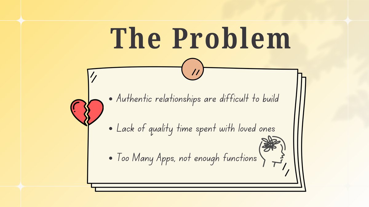
Planning a hangout got harder the moment we all left high school
Friend groups still wanted to stay close, but coordinating became harder once everyone had different schedules, schools, jobs, locations and routines.
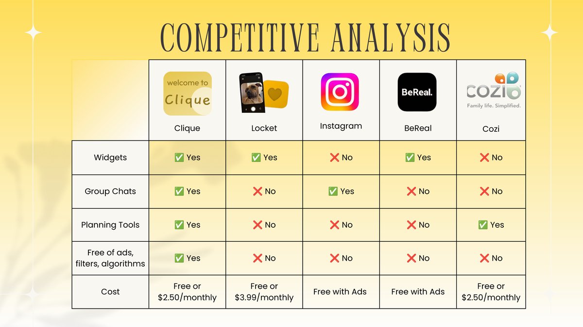
Most of the existing tools only solved one piece of it. Group chats were good for conversation, but plans got buried. Calendars were useful, but separate from the actual friend group. Camera rolls saved memories, but not in a shared group space.
What would a social app look like if it was built around private friend groups, memories and coordination instead of public posting or endless scrolling?
Research
The survey told me to build a tool, not a feed
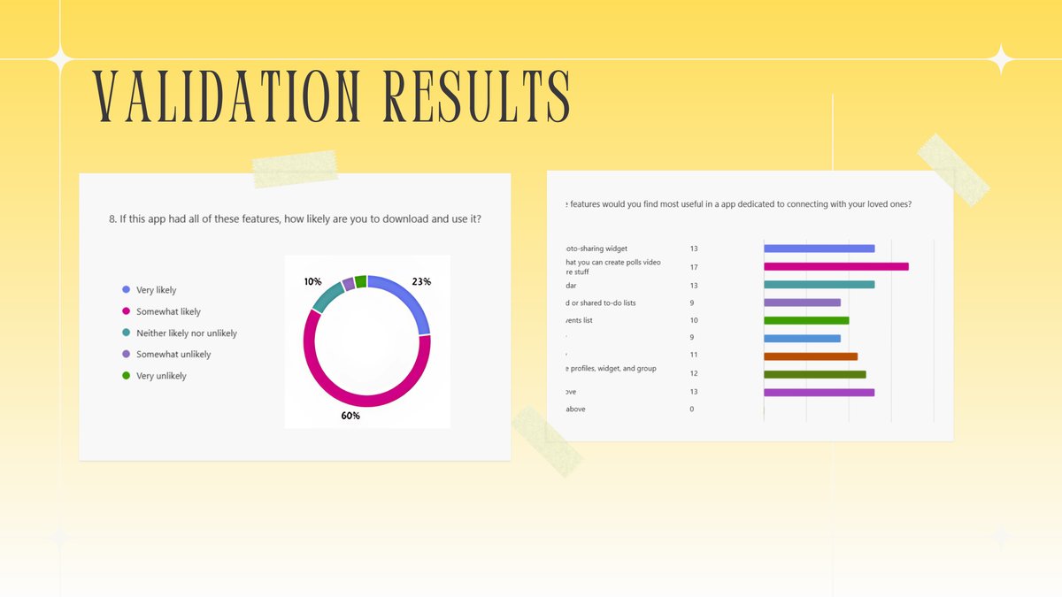
Ying Zhen, my business partner, and I ran a validation survey while the app was still an idea, and it reached 40 people. When we asked which features they would find most useful in an app for connecting with the people they love, a group chat with planning tools inside it beat every feature that stood on its own.
- A group chat where you can make polls and share video: 17.
- A photo-sharing widget: 13. A shared calendar: 13.
- Customizable profiles, widget and group: 12.
- An events list: 10. Shared to-do lists: 9.
- None of the above: 0.
Asked whether they would download an app with all of it, 23% said very likely and 60% said somewhat likely.
Ying also interviewed families and young adults in Chile and contacts in China. The finding from Chile changed my build order: tight-knit families who already live near each other need planning tools more than they need another place to post photos. That is why the shared calendar moved to the center instead of staying a nice-to-have.
I wrote this line in my notes and then built against it.
Pivot towards how this is a tool. Tools are built once and rarely updated. This app is meant to be a tool, it is meant to be functional, so the groupchat and the widget and the memory and the calendar should present itself as such.
The model
Five modules, drawn before a line of the app existed
In January 2025 the whole product was one diagram: an app with five modules hanging off it. Almost everything that followed is a child of this drawing.
- User authenticationsign up, log in, profile
Who you are, and which circles you belong to.
- Group chatreal-time messaging
The center of each friend circle, and the place every other tool hangs off.
- Alarm systempush notifications
The nudge to take a memory, and the reminder before an event starts.
- Photo sharingimage upload, group board
Memories that belong to the group instead of to a feed.
- Shared calendarcalendar integration, external sync
One calendar per circle, with the option to read your own and keep it private.
The first proof of concept was not mine. Ying is not technical, so she generated a placeholder interface and labelled what it should carry: a poll tab, an upcoming events tab, a shared calendar, and a palette of eight tools. Generic chat, real argument about what belongs in it, and something to react to before I built anything.
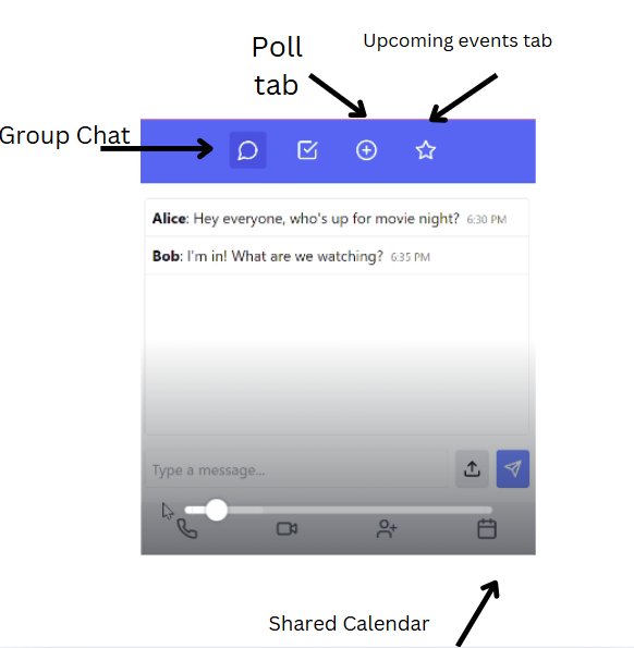
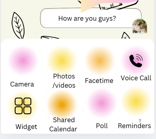
I learned Figma at the start of this project so I could test the idea visually before committing it to code. These are the first screens people ever reacted to.
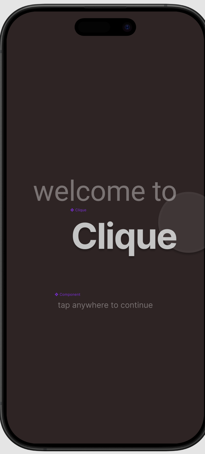
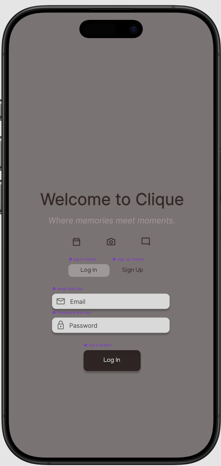
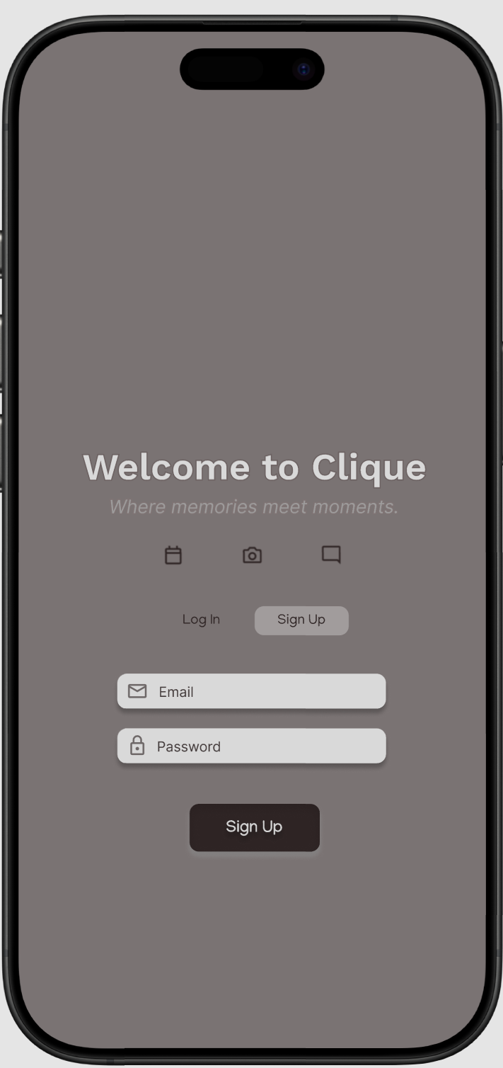
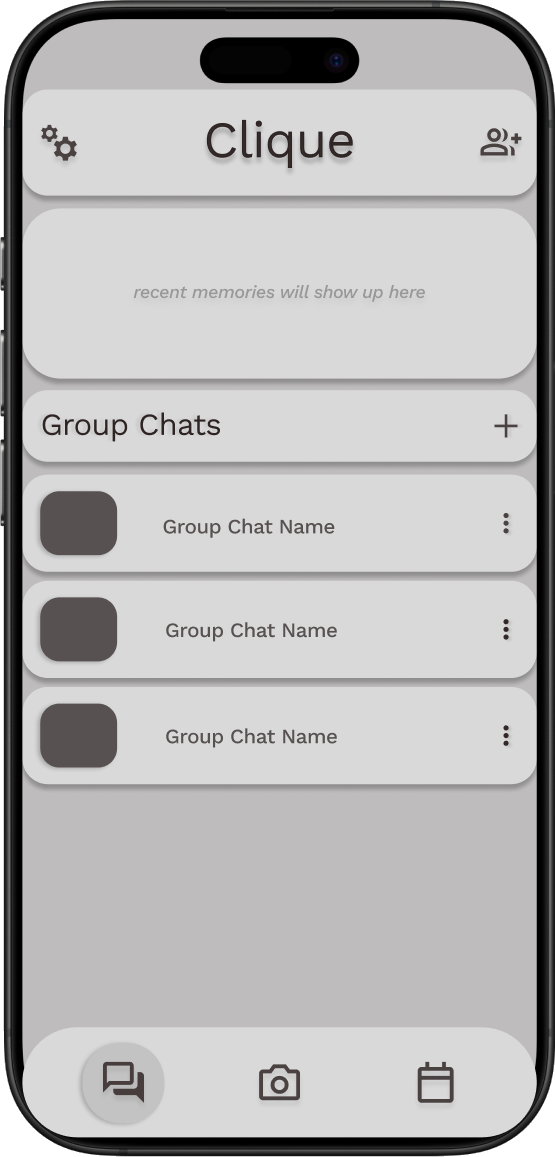
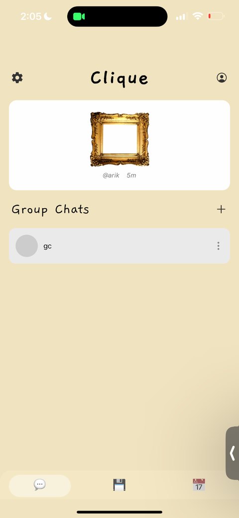
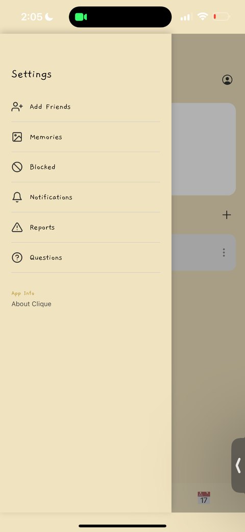
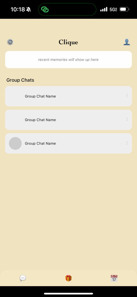
Then it had to run on a phone. This is the first build in the spring of 2025, on mine. The modules exist and almost nothing is finished: home is a placeholder telling me where memories will go, the group chats have no names, and the settings drawer is a list of words.
Testing
Fifteen people, five rounds, one notebook
I sat with 15 people one at a time, across five rounds spread over several months, and watched them use whatever version existed that week. Every note went into one document. When several people hit the same wall, it became work. When opinions split, my business partner made the call.
The notes are blunt, which is what makes them useful. Four of them changed the app the most.
- Where does the user naturally look first?
- What do they try to tap without being told?
- Does the screen explain itself visually?
- Is the next step obvious?
- Does the feature feel useful, or just decorative?
- Does this flow feel like a friend-group tool, and not just another social feed?
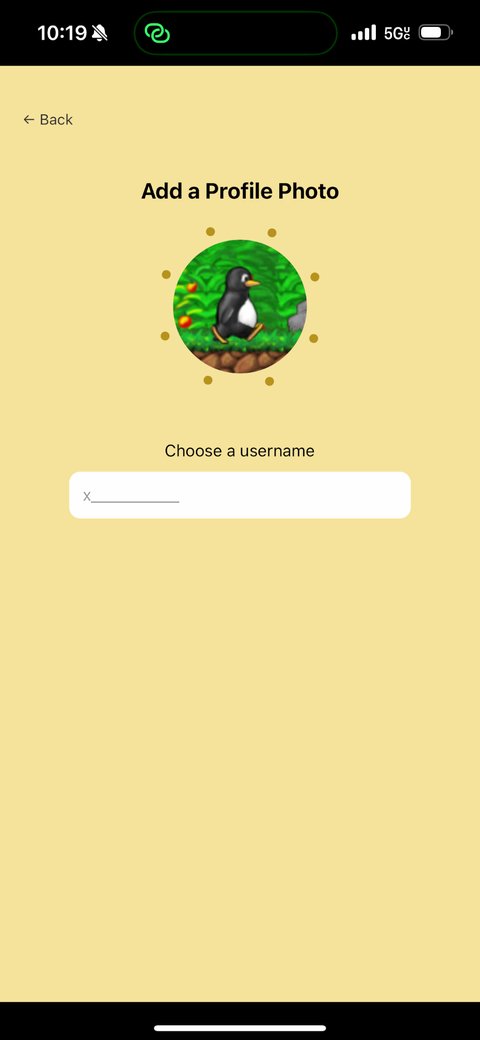
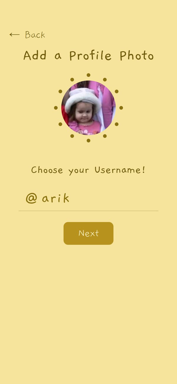
Onboarding: the dead end
From my notes that round
Hitting Skip doesn't do anything, it needs to route to home. The x _ _ _ _ is nice but it could be better and more intuitive. Need to add a back button to welcome, @username.
People got three screens into sign up and then hit a button that did nothing. The handwritten username field looked charming to me and read as decoration to them. I rebuilt the step so the field explains itself, Skip goes somewhere, and every screen can be left.
2025 build
Today
Memories: the frame that cut off the photo
From my notes that round
Memory box needs to show photo behind frame. Make polaroid frame not cut off the screen. Increase height of the memory preview section on the home screen.
The frames were images laid over a photo, so the photo sat in the wrong place and the polaroid ran off the edge. I rebuilt framing as one component that every screen shares, so a memory looks the same on the board, in the chat and on the screen where you make it. The caption now sits on the polaroid strip, where you would write it.
2025 build
Today
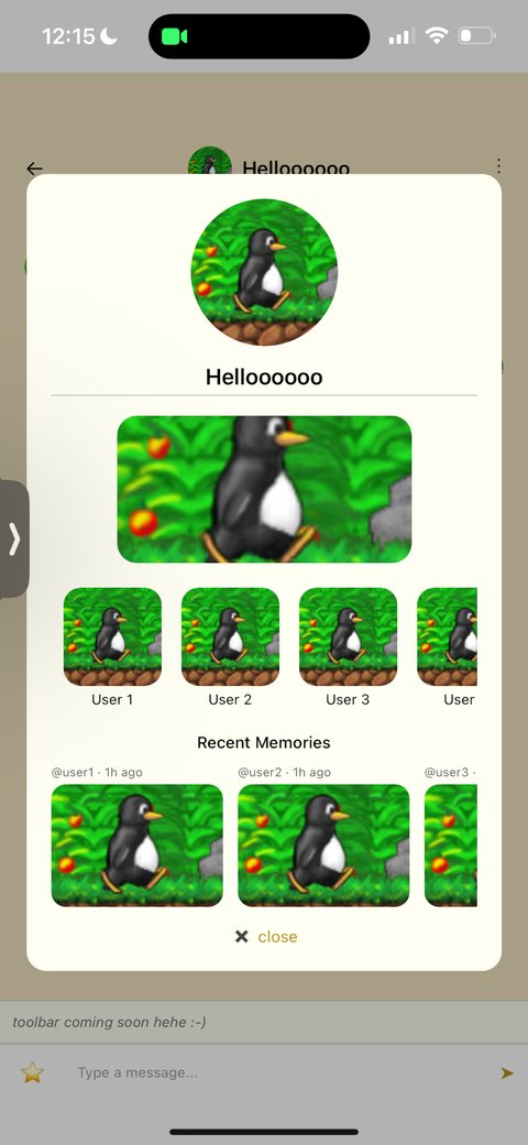
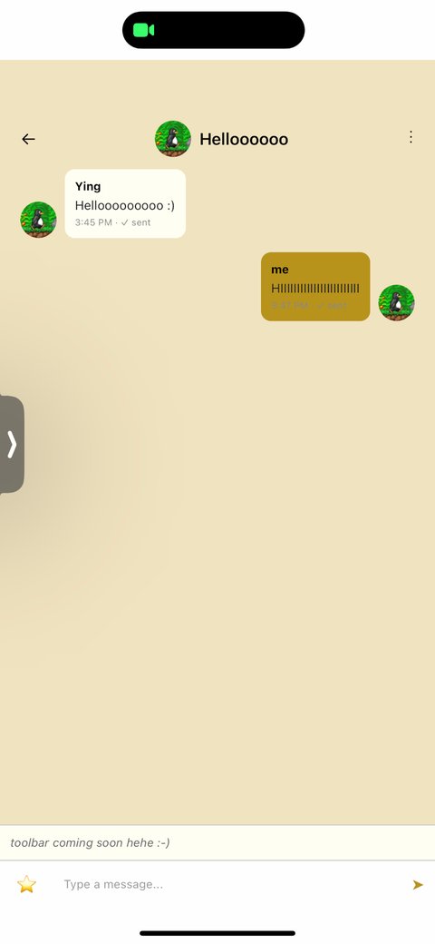
Group chat: a chat that could not do anything
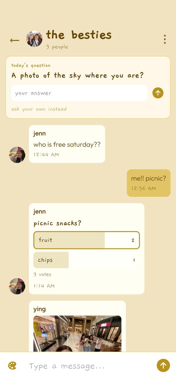
From my notes that round
Add a whatcha up to? button that sends out a notification to all users in the groupchat to notify them to take a memory. Make magic toolbar better. Make it horizontal.
The survey had already said a chat with tools inside it was the most wanted thing in the app, and the sessions said the tools were hiding. The palette became a horizontal row of things that work: a poll, a shared to-do list, a bill split, the camera, a nudge, and the day's question pinned at the top.
2025 build
Today
Home: nothing to come back to
From my notes that round
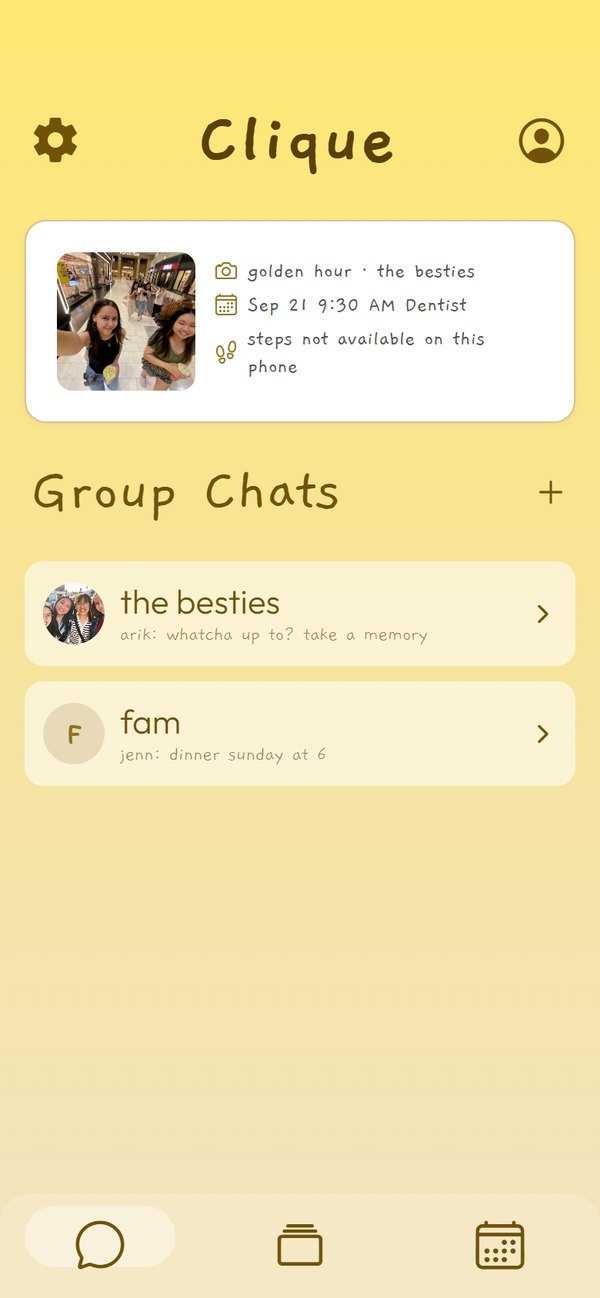
Display one memory statically for now in that section. Fix colors to brighter yellow and gradients.
Home was a list of chats and nothing else, so there was no reason to open the app unless someone had messaged you. It now opens on what changed since you last looked: the newest memory, the next thing on the calendar, and the group step streak.
2025 build
Today
The app
From the welcome screen to a group calendar
This is what shipped. Every screen below came out of the current build on the same phone, on the same afternoon.
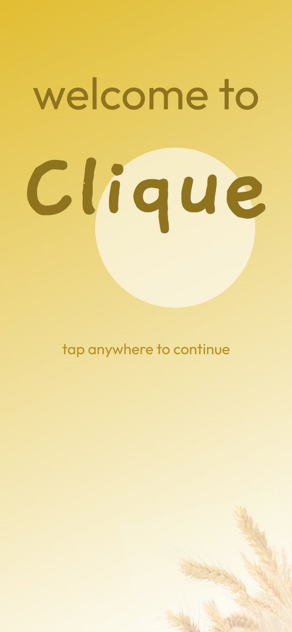
Onboarding: welcome, log in or sign up, pick a username, a welcome by name, and the introduction questions.
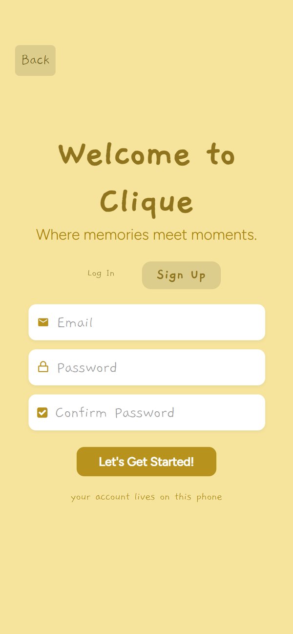
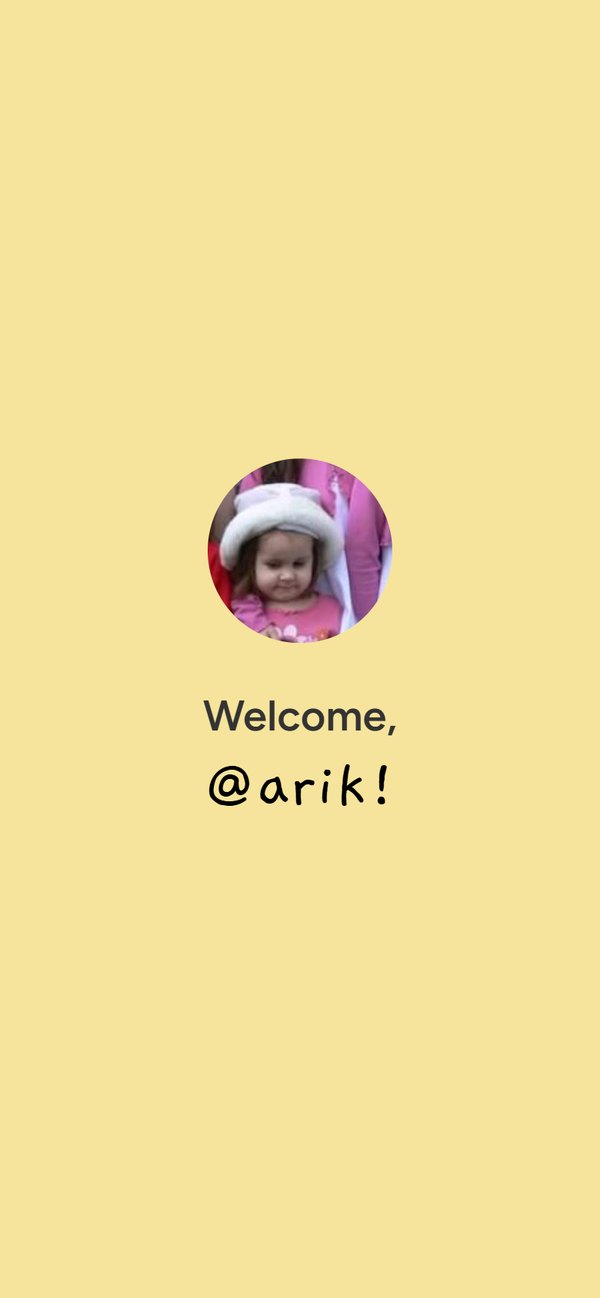
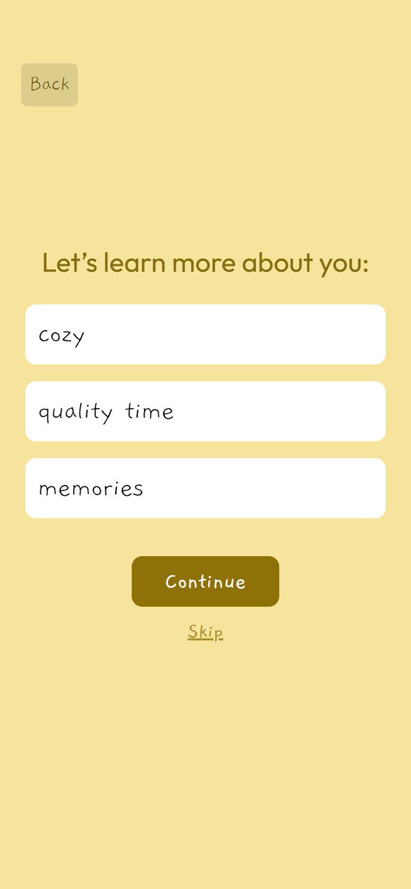
Then the circle itself: home, the settings drawer, making a group, the chat room, and the calendar with its month, week and day views.
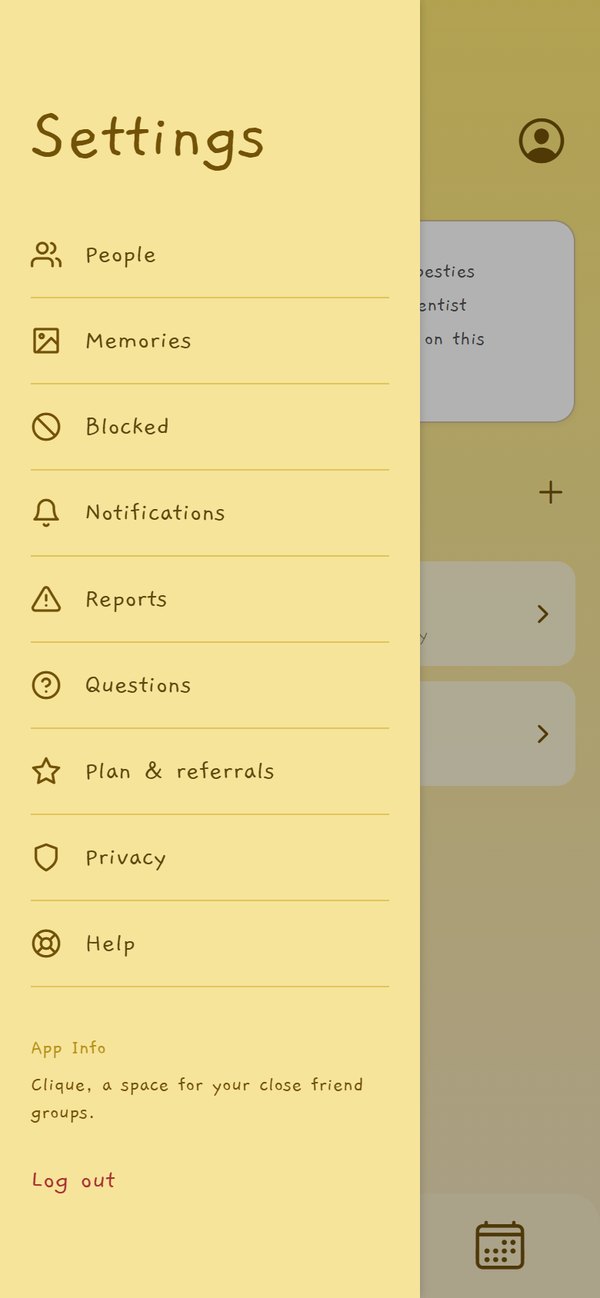
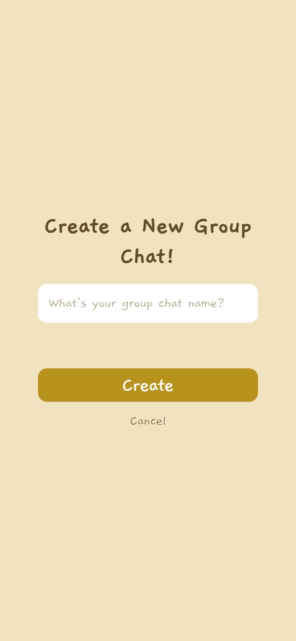
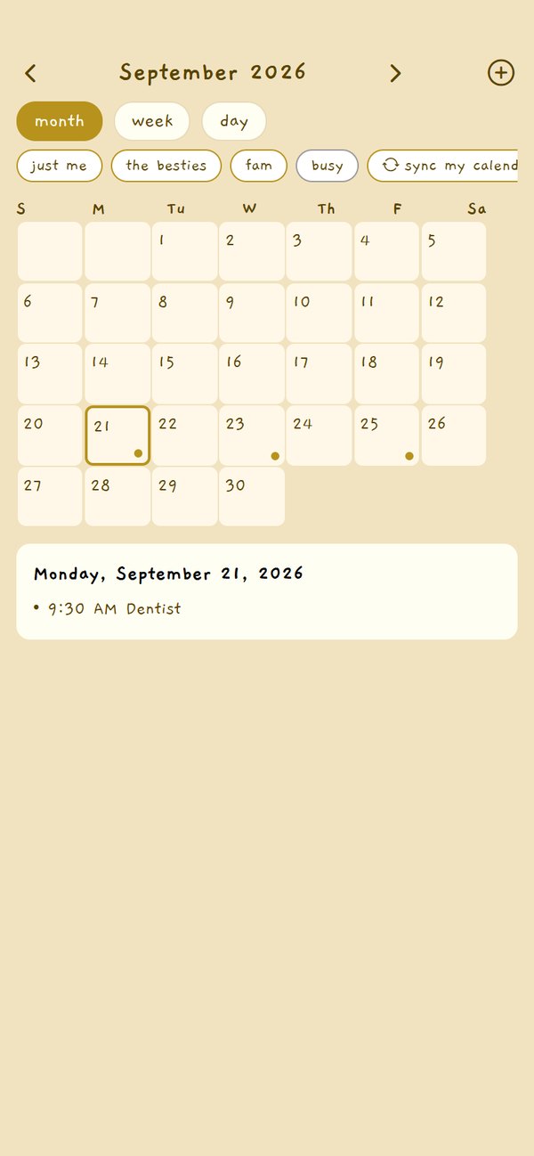
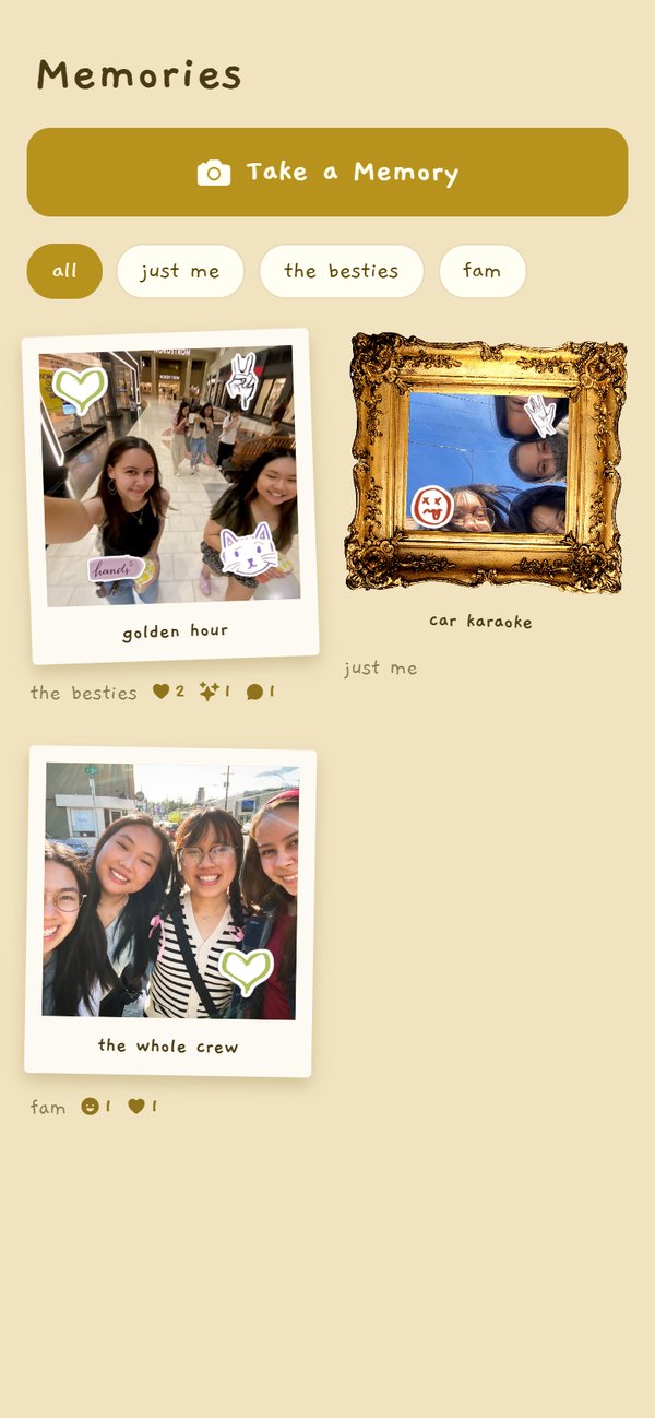
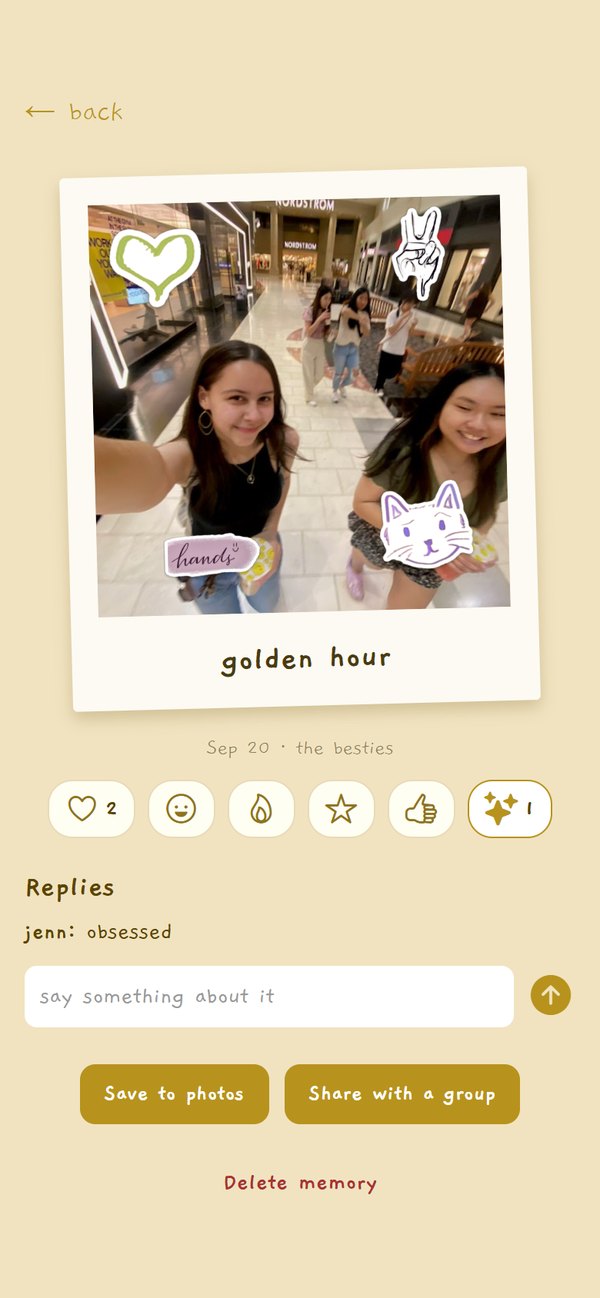
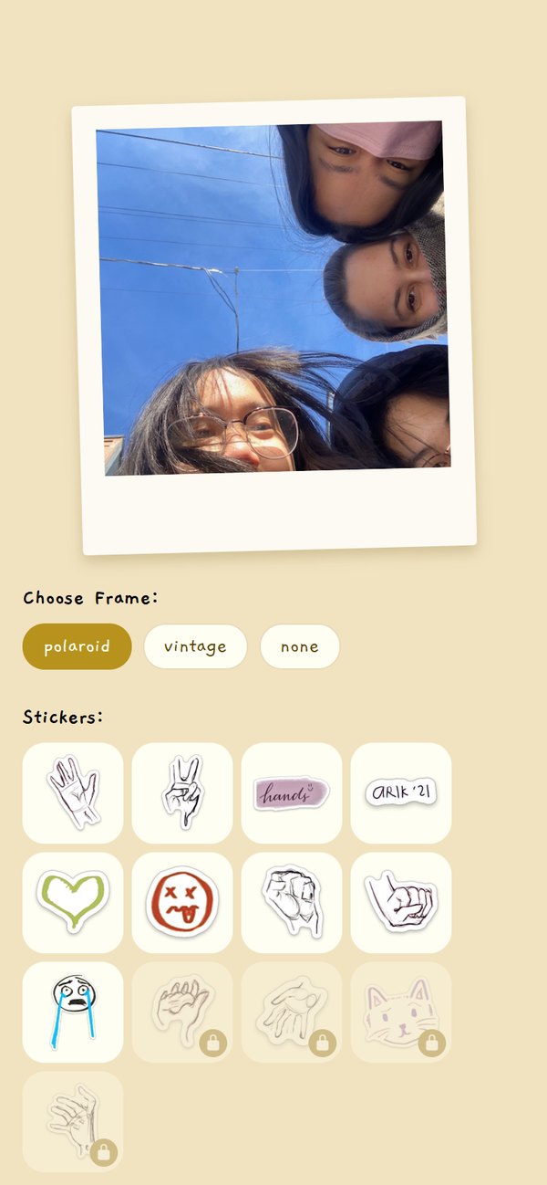
And the memory side: the board of everything a group has saved, one memory with its reactions and replies, and the screen where a photo gets its frame and stickers. The stickers are my own drawings, cut from a page of hand studies.
The build
I designed it, then I had to make it run
I was the only developer, so every design decision came back to me as an implementation problem. Three of them changed the design.
- The sidebars are overlays, not routes. Expo Router turns the file tree into navigation, and making settings a route meant losing the screen underneath it. Sliding it over the top kept the app feeling like one place.
- Everything saves on the phone first. A demo cannot depend on a network in a room full of judges, so the app keeps its own state and the cloud version sits behind the same screens.
- Stickers ship as local assets. Pulling them from a service meant a network call in the middle of making a memory, so the set is small, drawn by me, and always there.
What runs today
- Every screen, from sign up to a shared calendar, in one working app.
- Group chat with polls, a shared to-do list, a daily question, bill splitting and nudges.
- Memories with frames, hand-drawn stickers, reactions, replies and reminder schedules.
- A calendar with RSVPs, templates, anonymous busy blocks from your own calendar, and find a time.
- Plans, a trial and referral codes, plus privacy and help screens.
Built with
- React Native and Expo in TypeScript, with Expo Router for navigation.
- React context for shared state, saved to the phone.
- Firebase Auth, Firestore and Storage behind the same screens, with security rules.
- Expo Camera, Notifications, Calendar and Sensors for the device features.
- Jest for the logic: voting, balances, streaks, free-time overlaps and validation.
The outcome
Second place, and a demo that actually ran
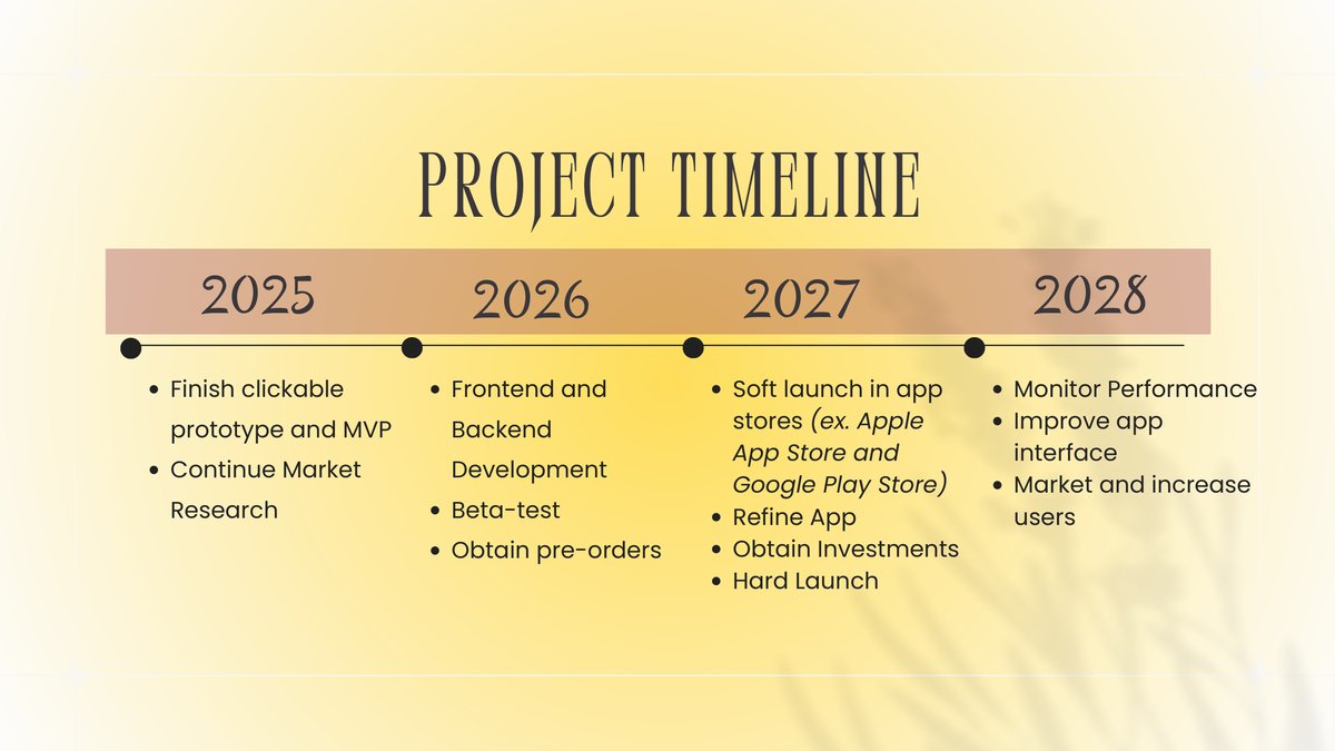
We pitched Clique at the University of Portland Pilot Venture Challenge and placed second. The pitch carried a business model, freemium tiers, a five-year projection and a $100K ask, and the app in the demo was the real one, running on a phone, not a slide.
Two questions from the judges did more for the product than the placing.
- How would privacy work if the app stores personal friend-group memories, messages and calendars?
- How does Clique avoid becoming another app that keeps people scrolling?
Both pushed in the same direction: private circles, clear permissions, calendar control, and memory-based interaction instead of a feed. The answer to the first one is in the app now. Your own calendar is read into anonymous busy blocks that never leave the phone, so a group can find a free hour without anyone seeing anyone else's day.

Reflection
What I would do differently
I cut a feature, and the next round of testing brought it back. The step tracker was dropped early because it read as a fitness feature in an app about staying close. Later sessions said the opposite: step counts are already something friend groups compare. It came back as a streak that unlocks sticker sets, which is the version people described rather than the one I first built.
My prettiest idea was my least usable one. The handwritten username field is still the thing I liked most in the first build, and it is the thing testers stumbled on hardest. Watching someone hesitate over it taught me more than any amount of staring at my own screens.
I trusted the survey too late. The number that mattered, a chat with tools inside it beating every standalone feature, was in front of me before I wrote any code, and I still spent the first build making screens look right instead of making the chat do things.
What I would test next. Everything multi-person is still unproven: whether reminder schedules feel like care or nagging, whether a group actually settles a bill split, and whether find a time survives contact with five real calendars. That needs a second phone and a server, which is the next build, not this one.
Credit
Who built it
I designed and built the app. Ying Zhen, my business partner, brought the first proof of concept, the business case, the international research and the pitch. We worked together every two weeks for six months.